1
2
3
4
5
6
7
8
9
10
11
12
13
14
15
16
17
18
19
20
21
22
23
24
25
26
27
28
29
30
31
32
33
34
35
36
37
38
39
40
41
42
43
44
45
46
47
48
49
50
51
52
53
54
55
56
57
58
59
60
61
62
63
64
65
66
67
68
69
70
71
72
73
74
75
76
77
78
79
80
81
82
83
84
85
86
87
88
89
90
91
92
93
94
95
96
97
98
99
100
101
102
103
104
105
106
107
108
109
110
111
112
113
114
115
116
117
118
119
120
121
122
123
124
125
126
127
128
129
130
131
132
133
134
135
136
137
138
139
140
141
142
143
144
145
146
147
148
149
150
151
152
153
154
155
156
157
158
159
160
161
162
163
164
165
166
167
168
169
170
171
172
173
174
175
176
177
178
179
180
181
182
|
import type { ParamsType, ProTableProps } from '@ant-design/pro-components';
import { ProTable } from '@ant-design/pro-components';
import { Icon } from 'antd';
import { isBoolean } from 'lodash';
import React, { ReactNode, useMemo } from 'react';
export declare type CSProTableProps<DataSource, U, ValueType = 'text'> = {
searchTitle?: string | ReactNode;
excludeEllipsis?: string[];
persistenceKey?: string;
} & ProTableProps<DataSource, U, ValueType>;
const CSProTable = <
DataType extends Record<string, any>,
Params extends ParamsType = ParamsType,
ValueType = 'text',
>(
props: CSProTableProps<DataType, Params, ValueType>
) => {
const {
searchTitle,
excludeEllipsis = [],
columns = [],
pagination = {},
search,
scroll = {},
searchFormRender,
persistenceKey,
columnsState,
options,
cardBordered = true,
bordered = true,
...rest } = props
const newColumns = useMemo(() => {
const nc: any = columns?.map?.(it => {
const { dataIndex = '', valueType = '' }: any = it
const tempIt = { ...it, ellipsis: true }
if (excludeEllipsis?.includes?.(dataIndex)) {
tempIt.ellipsis = false
}
if (it?.hasOwnProperty('ellipsis')) {
tempIt.ellipsis = it?.ellipsis
}
if (it?.hasOwnProperty('valueEnum') || valueType === 'select') {
tempIt.fieldProps = { showSearch: true, ...tempIt?.fieldProps }
}
if (dataIndex === 'option' || valueType === 'option') {
tempIt.fixed = 'right'
tempIt.hideInSetting = true
}
if (dataIndex === 'index' || valueType === 'index') {
tempIt.fixed = 'left'
}
if (dataIndex === 'indexBorder' || valueType === 'indexBorder') {
tempIt.fixed = 'left'
}
return tempIt
})
return nc
}, [columns, excludeEllipsis])
const newOptions = useMemo(() => {
let no = {}
if (options) {
no = options
if (!options?.hasOwnProperty?.('reloadIcon')) {
no = { ...no, reloadIcon: <Icon type="icon-shuaxin" /> }
}
if (!options?.hasOwnProperty?.('density')) {
no = { ...no, density: false }
}
if (!options?.hasOwnProperty?.('setting')) {
let setting = options?.setting
if (isBoolean(setting)) {
no = { ...no, setting }
} else {
if (!setting?.hasOwnProperty?.('settingIcon')) {
setting = { ...setting, settingIcon: <CFIcon type="icon-shezhi" /> }
}
no = { ...no, setting }
}
}
} else if (isBoolean(options)) {
no = options
} else {
no = {
setting: {
draggable: true,
settingIcon: <Icon type="icon-shezhi" />
},
reloadIcon: <Icon type="icon-shuaxin" />,
density: false
}
}
return no
}, [])
const newPagination = useMemo(() => {
let np = {}
if (pagination) {
np = pagination
if (!pagination?.hasOwnProperty?.('showSizeChanger')) {
np = { ...np, showSizeChanger: true }
}
if (!pagination?.hasOwnProperty?.('showQuickJumper')) {
np = { ...np, showQuickJumper: true }
}
} else if (isBoolean(pagination)) {
np = options
} else {
np = {
showSizeChanger: true,
showQuickJumper: true
}
}
return np
}, [])
const newColumnsState = useMemo(() => {
let ncs: any = {
persistenceType: 'localStorage',
}
if (persistenceKey && !columnsState) {
ncs.persistenceKey = persistenceKey
}
if (columnsState) {
ncs = { ...ncs, columnsState }
if (!ncs?.persistenceKey && persistenceKey) {
ncs.persistenceKey = persistenceKey
}
}
return ncs
}, [persistenceKey, columnsState])
const newSearch = useMemo(() => {
let ns: any = {
span: {
xs: 24,
sm: 24,
md: 12,
lg: 8,
xl: 6,
xxl: 6,
}
}
if (isBoolean(search)) {
ns = search
} else {
ns = { ...ns, ...search }
}
return ns
}, [search])
const newScroll = useMemo(() => {
return { x: 1300, ...scroll }
}, [scroll])
const newSearchFormRender = (props, defaultDom) => {
return <>
{searchTitle && <div className='searchTitle absolute text-base z-50 font-medium text-[#333]' style={{ top: '40px', left: '44px' }}>{searchTitle}</div>}
{defaultDom}
</>
}
const getTableProps = () => ({
...rest,
cardBordered,
bordered,
columnsState: newColumnsState,
search: newSearch,
scroll: newScroll,
pagination: newPagination,
columns: newColumns,
options: newOptions,
searchFormRender: searchFormRender ? searchFormRender : newSearchFormRender
})
return (
<ProTable<DataType, Params, ValueType>
{...getTableProps()}
>{props?.children}</ProTable>
);
};
export { CSProTable };
|


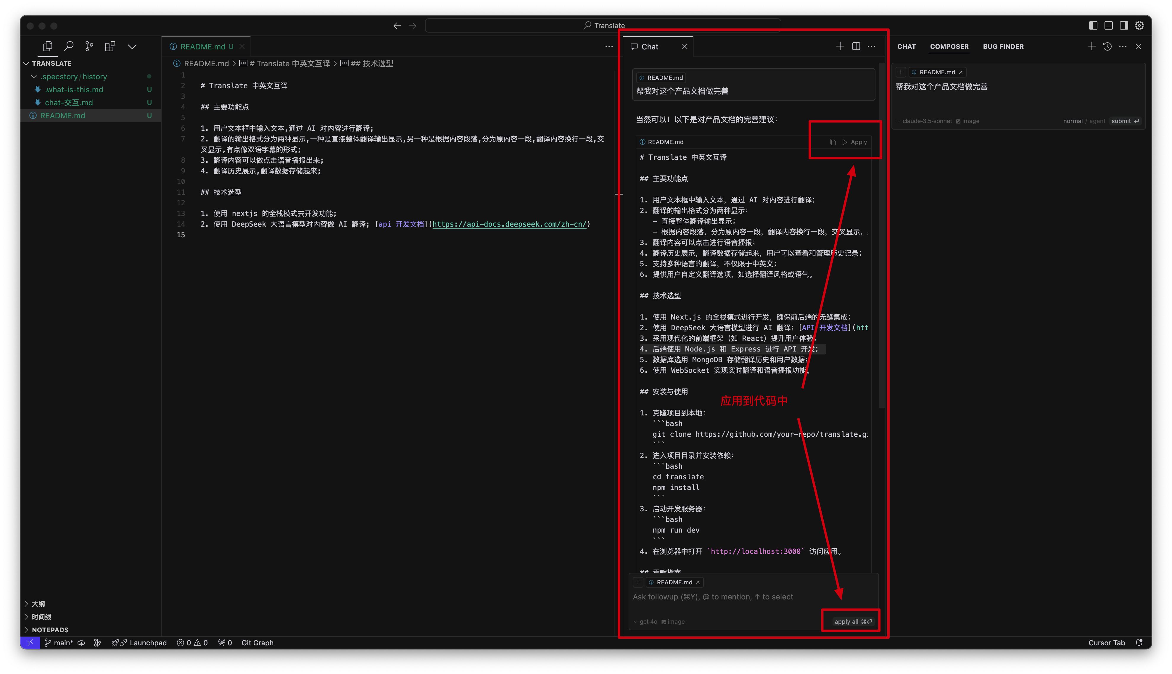


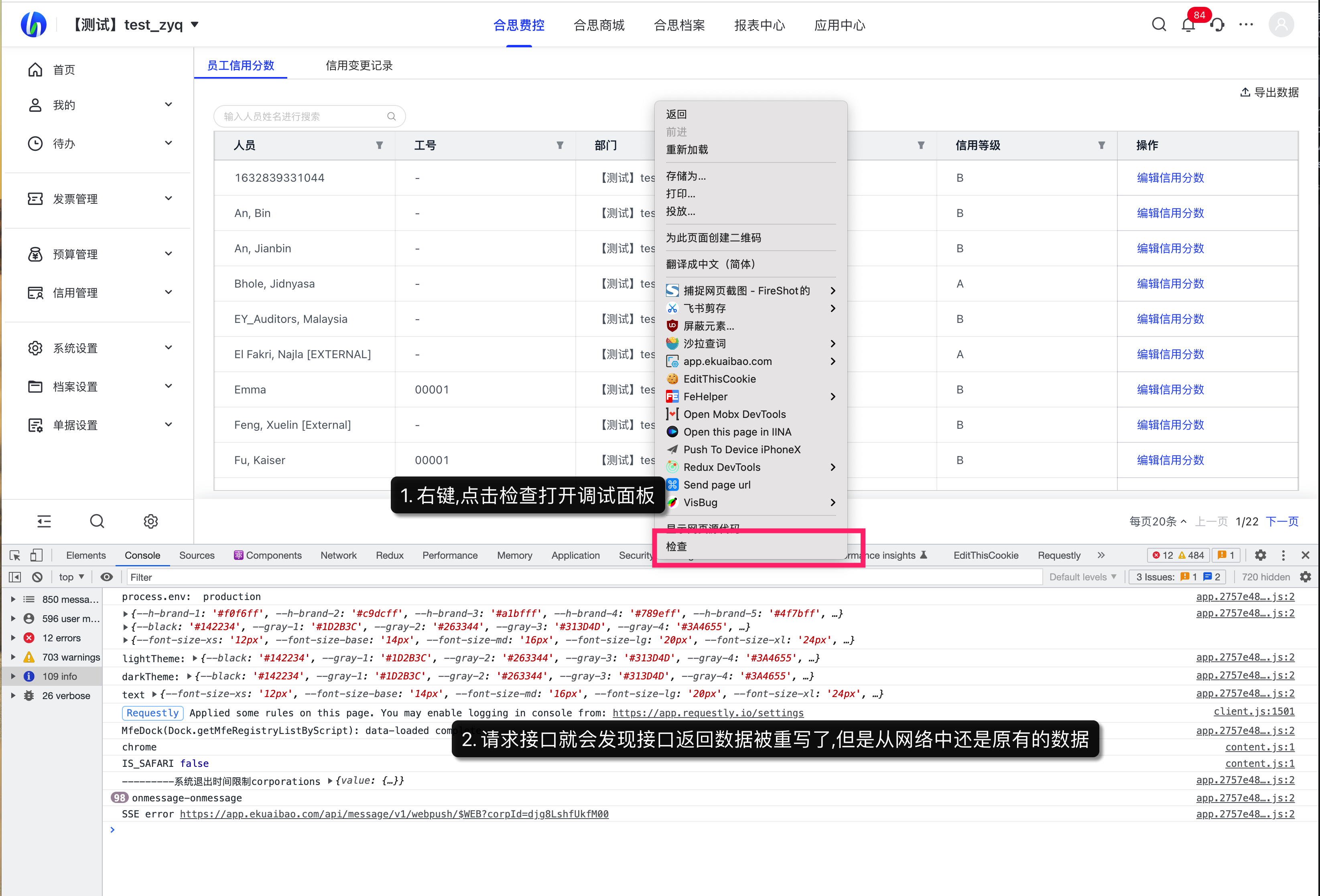
.png)
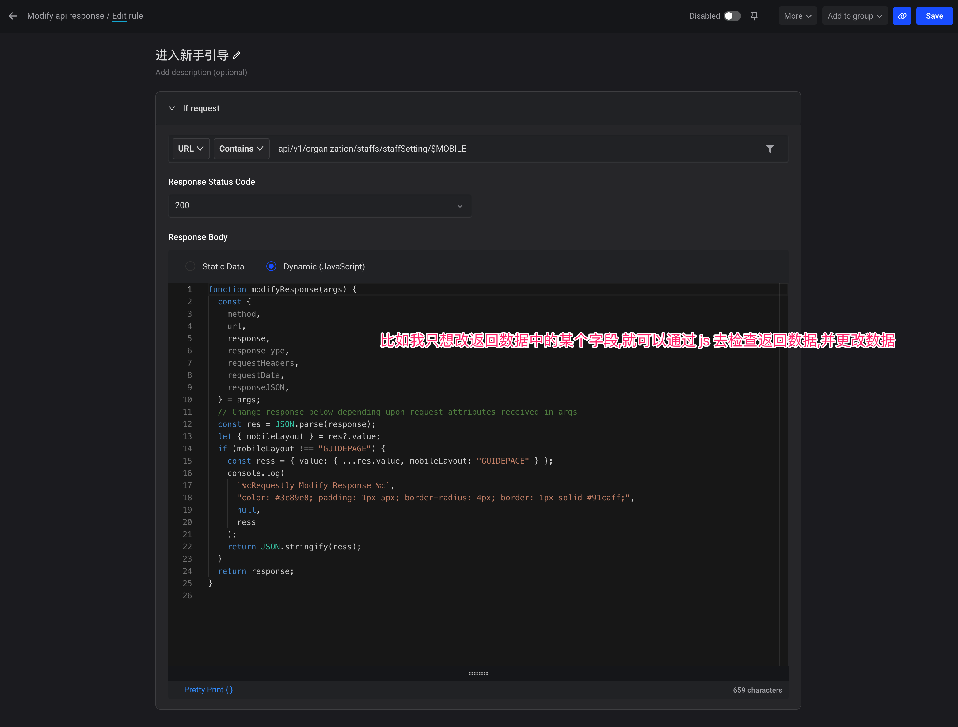
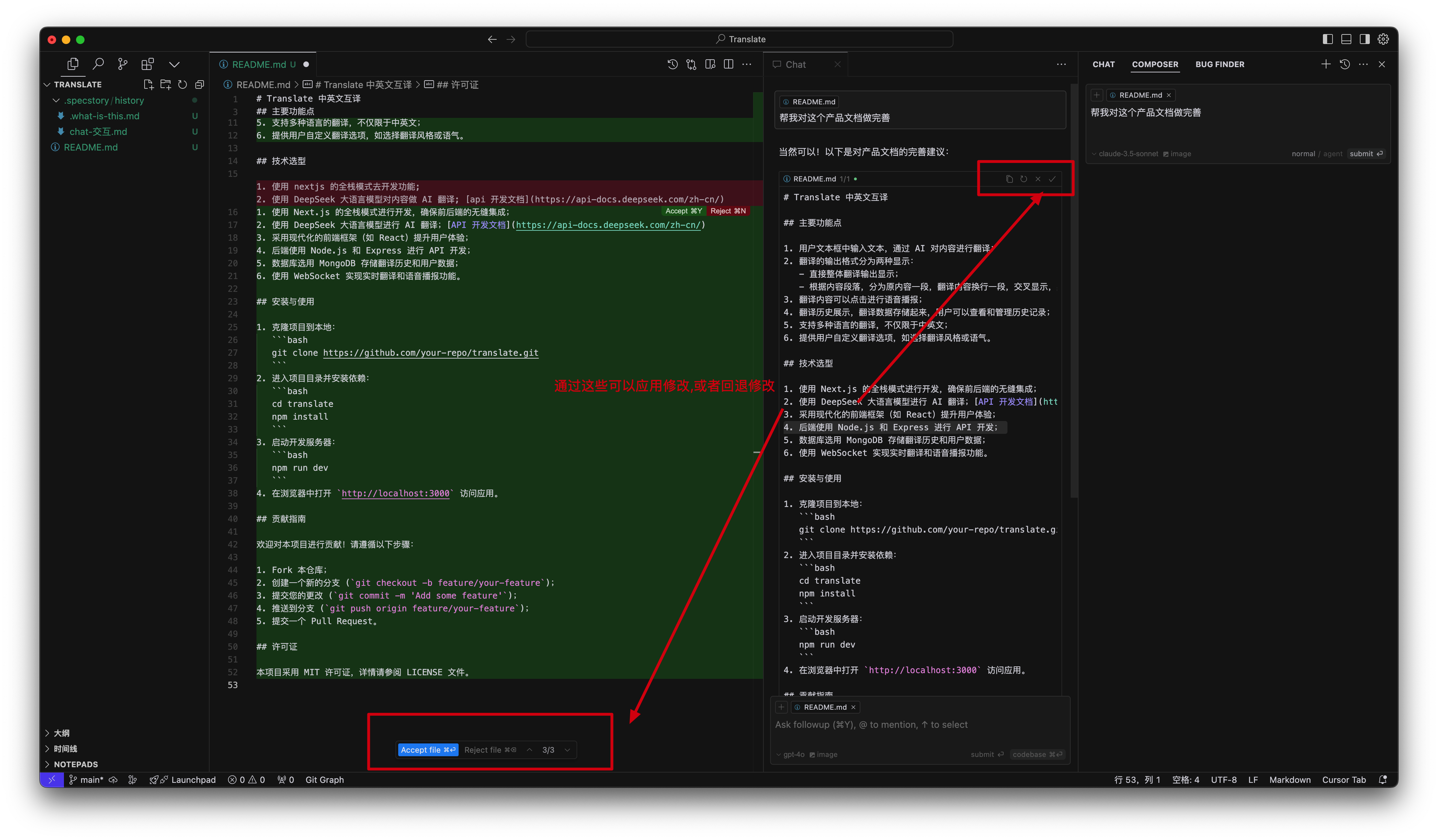
.png)
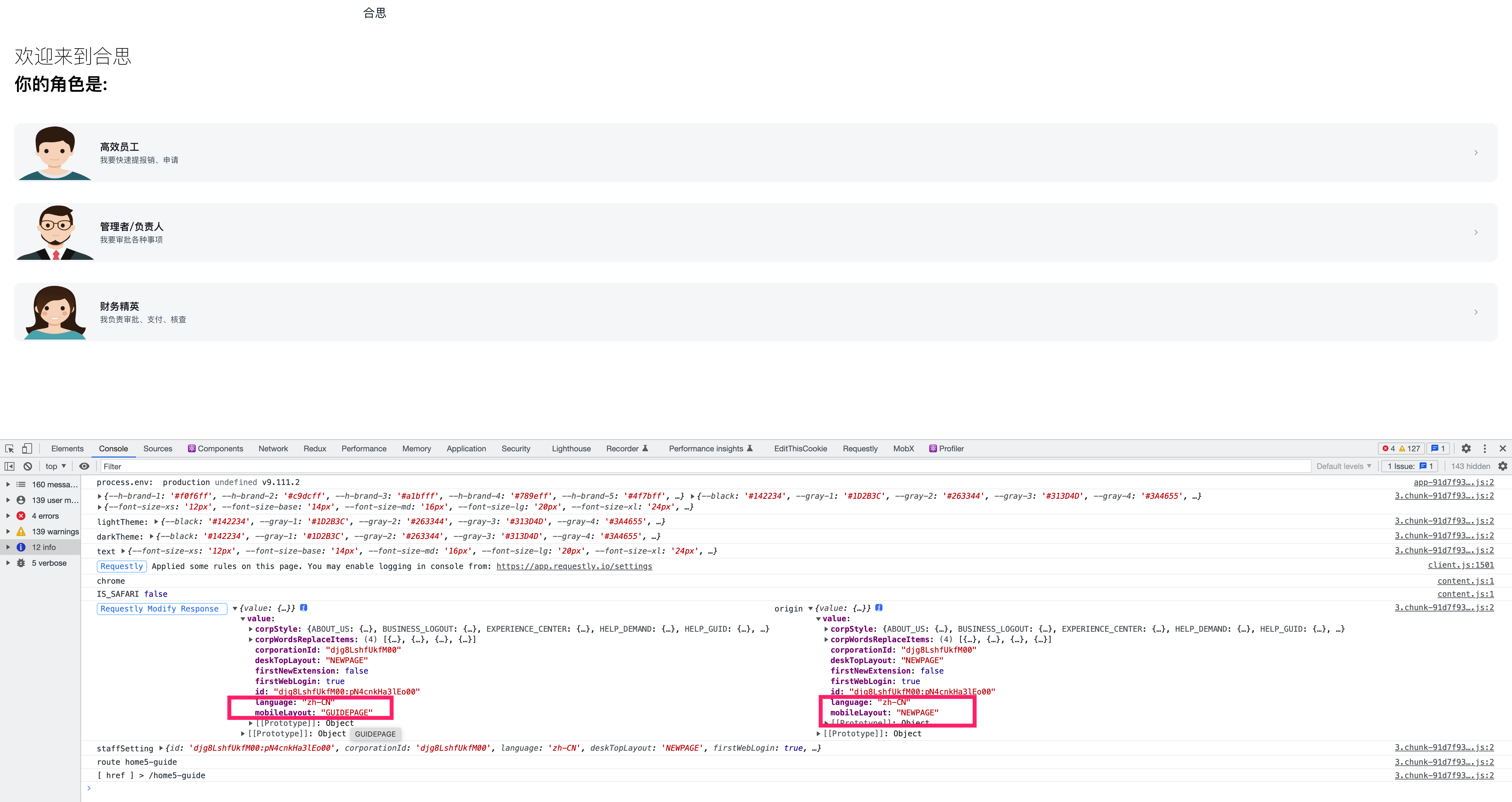
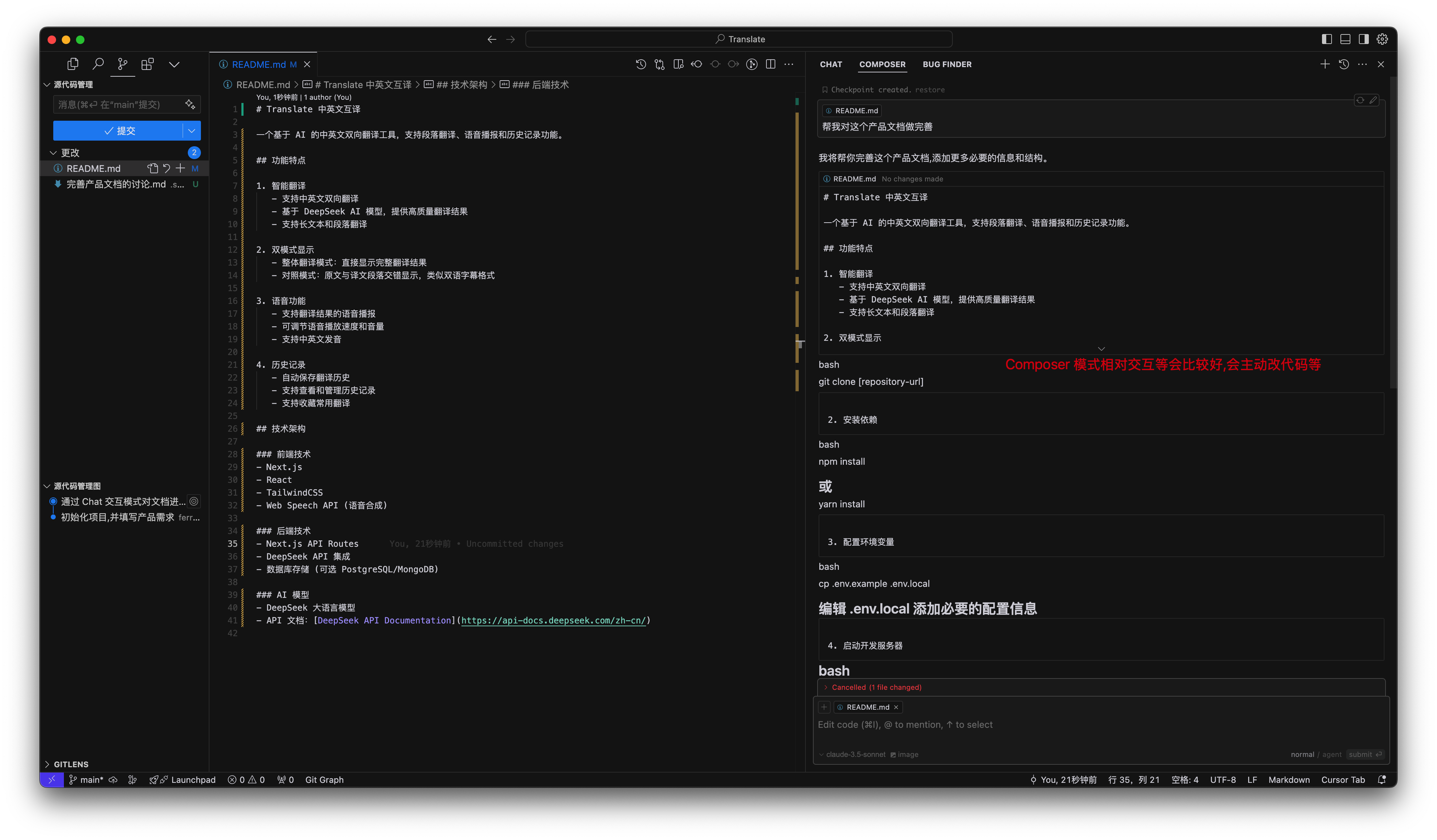
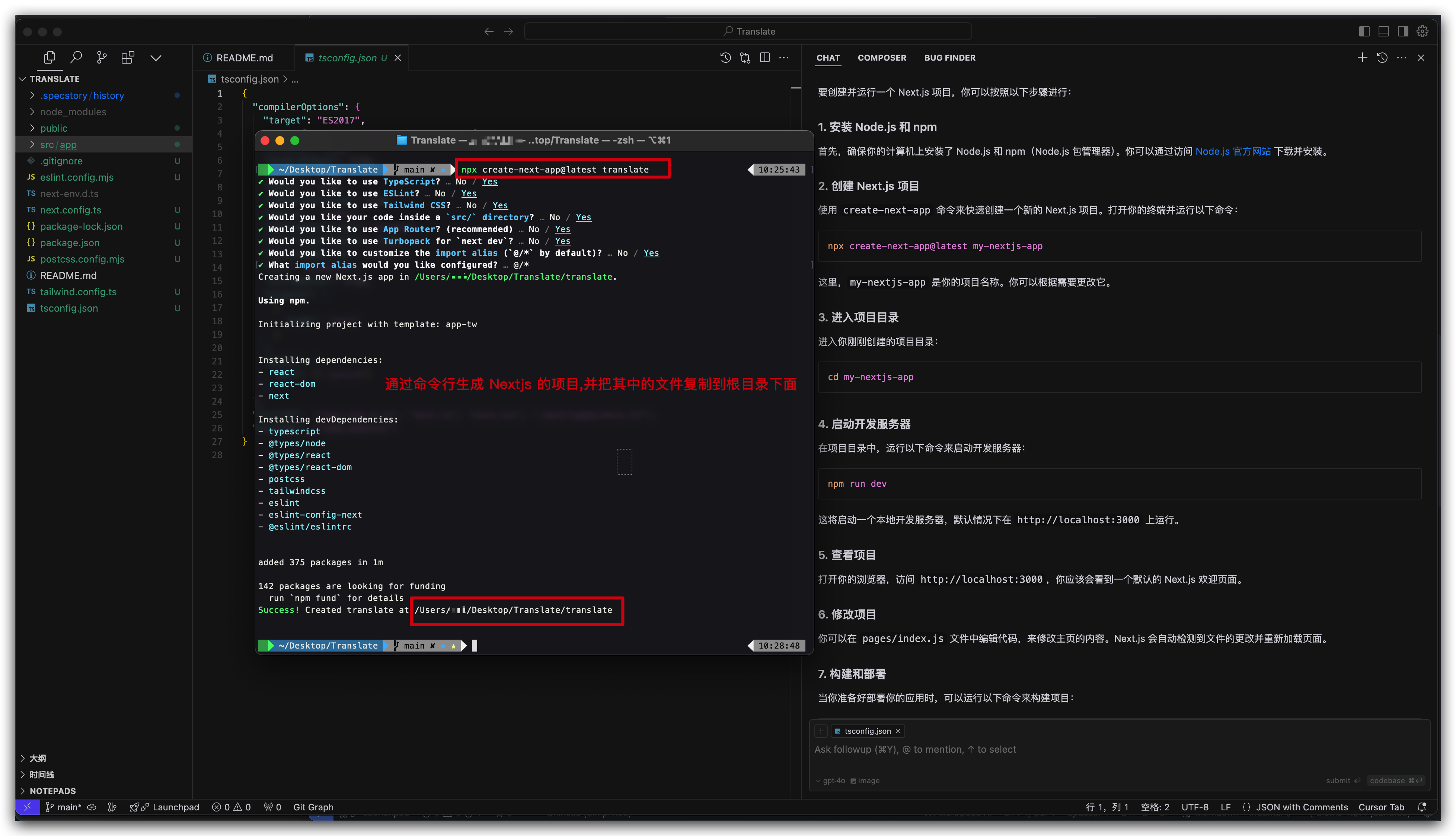
.png)